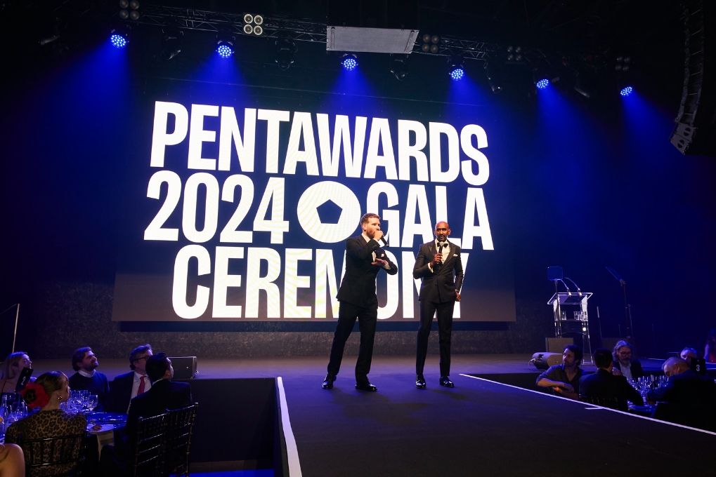
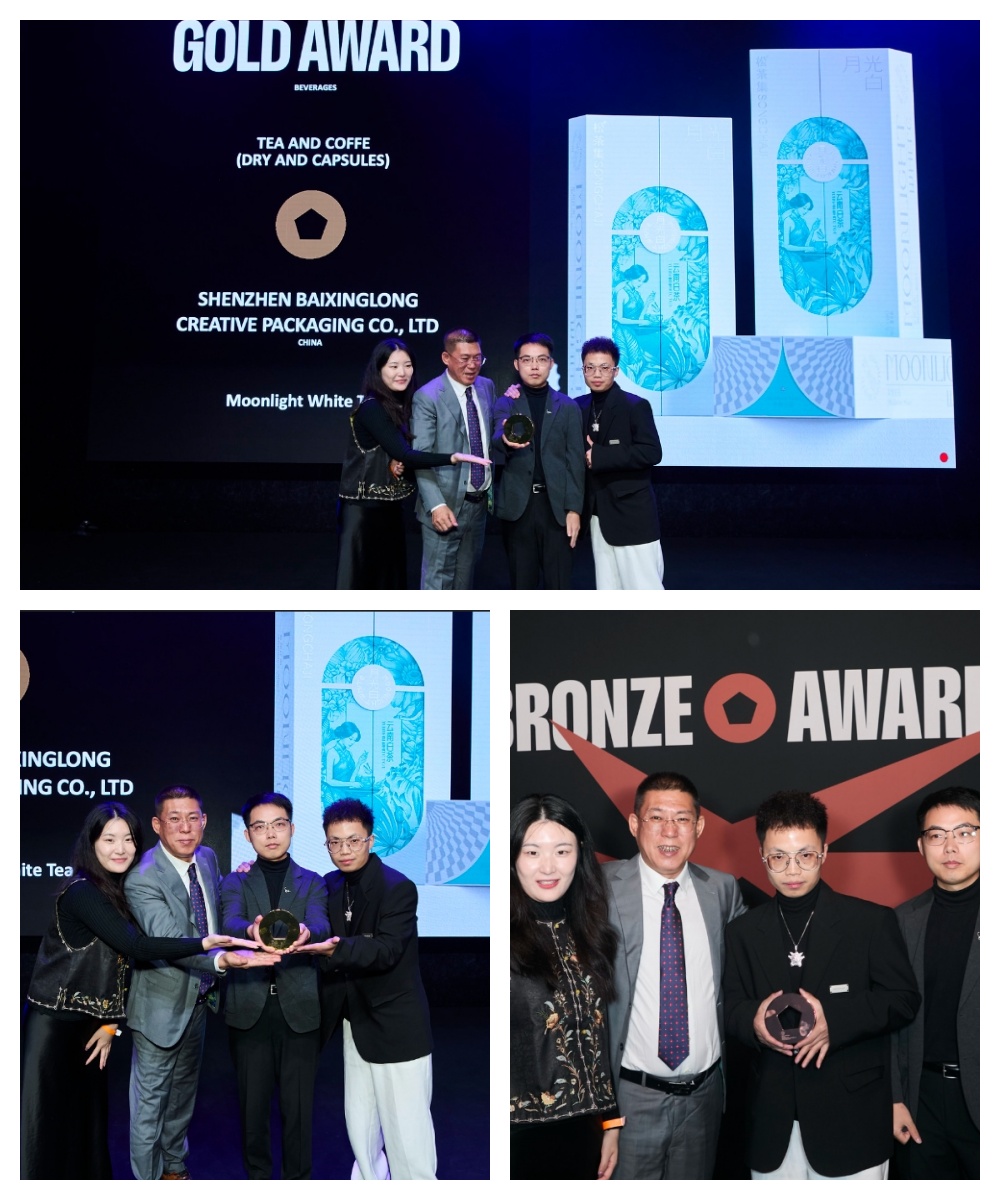
On the evening of October 25th, local time, the winners of the 2024 PENTAWARDS Packaging Design Award, which is well-known in the industry and attracts worldwide attention, were announced.
Bai Xinglong’s five original design works stood out from the global design field with their unique creative design concepts and outstanding artistic aesthetics and won five PENTAWARDS design awards.
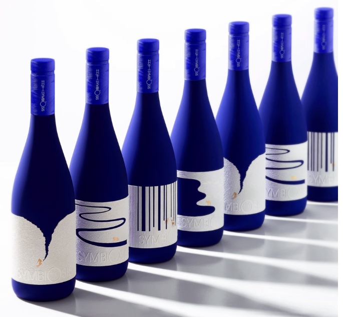
At the PENTAWARDS awards ceremony, the surprise grand prize – KURZ Best Decoration Application Award was unveiled. For the first time in history, the PENTAWARDS official competition cooperated with LEONHARDKURZ to create a new special award to celebrate outstanding performance in decoration. Bai Xinglong’s original work “Symbiotic Wine” won the KURZ Best Decoration Application Award – Silver Award.
Symbiosis is a cutting-edge brand. Symbiosis means that all things in the universe coexist, are interrelated and influence each other. The brand’s business philosophy presents products and brands with a new perspective and technique. This creation takes “the most beautiful moment” as the theme, seeks inspiration from the surroundings and nature, and records the most beautiful moments of cooperation between all things in the universe. White grape wine is used as the carrier of this creation, and creative expression is made on the wine label. Inspiration is obtained from four scenes (forest, desert snow mountain, grassland) to record the most beautiful moments. With blue and white as the main body, gold as embellishment, and a large area of blank space, it reflects the beauty of nature’s artistic conception and the high-quality sense of the product.
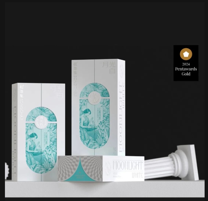
Moonlight white tea,Gold Award packaging design
Moonlight White Tea is an exquisite tea originating from Yunnan, China. Its uniqueness lies in the fact that the moonlight at night is used in the production process, hence the name “Moonlight Beauty”. The packaging is based on the color close to the moonlight, using elegant white, light red and silver to highlight the mystery and purity of the moonlight.
The illustration adopts the neoclassical style, presenting the scenery of the girl and the moonlight complementing each other, showing a quiet and elegant atmosphere. The illustration outlines the girl’s outline with delicate and soft lines, which complements the pure characteristics of the product.
This white tea packaging is designed to attract young consumers, break through the style and tonality of traditional tea packaging, and hope that young people will accept and understand China’s tea culture, and provide consumers with a quiet and comfortable tea experience, so that tea tasting becomes a pleasant ritual in people’s lives.
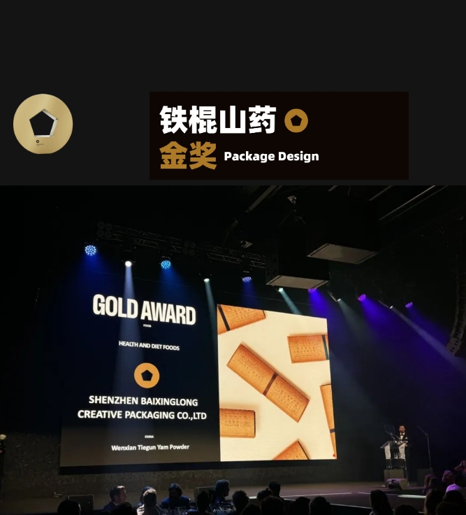
Iron rod yam, gold packaging design
The Tiegun Yam is native to Wen County, Henan Province, China. It is famous for its unique image and nutritional value, so we created a high-value packaging for it.
The packaging form conveys the original and natural characteristics by restoring the exclusive characteristics of the Tiegun Yam. The discarded yam skin is ground and crushed, and then merged with the pulp again to make it part of the outer packaging. The overall packaging is more environmentally friendly, green and sustainable.
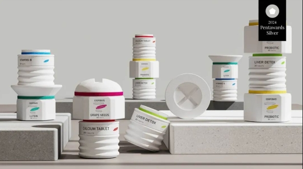
COOPERATE health care product packaging, silver award packaging design
COOPERATE is a health product that explores the future trend of health. It interprets the concept of separation and integration through the structure of screws and nuts.
Spiral movement means maximum efficiency. This product cleverly combines the screw structure with health products. They can be closely connected or combined at will, thus solving the choice of different consumers for the efficacy of health products. The change of bright colors deepens the product memory point to a certain extent.
Borrowing the unique appearance of screws, its minimalist shape has a strong recognition and is easy to carry, place and reuse, which well responds to the sustainable development concept of “healthy and natural”.
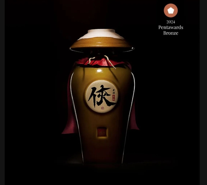
Guo Da Xia highly liquor,Bronze Award for packaging design
Guo Daxia Liquor, with Chinese martial arts culture as the background, shows the perfect combination of knight culture and liquor culture. The super symbol “Xia” is designed visually, and the symbol of the fist-holding ceremony is integrated into the font strokes.
Each pot of wine is paired with a traditional Chinese wine bowl, which is buckled on the bottle. The whole packaging looks like a heroic knight, which is memorable.
Bai Xinglong has always been committed to innovation and breakthroughs, and has won recognition from numerous awards at home and abroad with its outstanding creative design and innovation capabilities.
So far, Bai Xinglong has won 138 international design awards. The honor of the Pentawards Award is not only a recognition of Bai Xinglong’s outstanding strength in the field of packaging design, but also an affirmation of his continuous innovation and spirit of continuous transcendence.
In the future, the Bai Xinglong team will continue to uphold the concept of innovation and sustainable development, continue to explore and practice, bring more wonderful works and more surprises to the global creative design community, give the brand a stronger value, and promote the continuous development and progress of the industry.
Post time: Oct-29-2024

